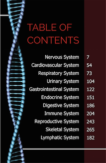
 This first TOC Examples was my favorite one I saw. The example would definitely match my Front cover with a tiny small adjustments. I liked this TOC due to the colors that were used and the size of the text. The colors would help match my front cover and makes the font/design easy to look at. The size of the text also helps visually. The only possible downside due to this could be it's simplicity, however, I personally believe the simpler the better. 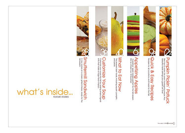 This TOC example I liked a lot. The only change I'd need to make with this design is turn it 90 degrees to the left and change the color from white to black to make it match my front cover design. I like that this design has pictures of what the topic is about, as well as a description to go along with it. This will readers attention to the topic and allow them to know what the topic is about. The front is also very easy to read and see which increases the accessibility of the magazine. 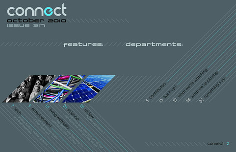 This last TOC example is one of my favorites i've seen. The background color is nice and matches my magazine design, the design is very well made, and it appears the title of the magazine is on the TOC which is a nice twist to the usual TOC's. This TOC does have some unfortunate problems though. The left side of the magazine works very well with pictures and descriptions of the topics, however, the right side didn't have as much effort involved. If I changed this so every topic had a picture and text the TOC would drastically improve. Another problem is the text font, with the color of the lines and background, it makes it hard to read some of the topics and examples so I'd have to change the color contrast to increase the accessibility and make it easier to read. Other than that the overall design and potential of this TOC made me pick it.
0 Comments
Notes
|
AuthorAndrew S Burke, P7 AICE Media Studies, Cambridge student Archives
April 2021
Categories |

 RSS Feed
